
Alternative PostgreSQL plugin for munin
Abstract
I've been using the PostgreSQL graphs which come bundled with munin for quite some time. But recently I've come annoyed with the amount of graphs those plugins generate. I've decided to fix this in the existing plugins, but ran into a design dilemma. It prompted me to re-write the plugins. During this I discovered a couple of interesting facts about both PostgreSQL stats, and the existing graphs. This blog-post (which is the first in a series) will give some context to the ongoing development and put my thoughs "on paper".
Stipulations
First, the new plugins should work like the snmp__if_multi plugin. Meaning, the main dashboard should show an aggregated graph. Upon clicking on it it should show a more readable breakdown before going to the yearly overview. Second, the graphs should avoid an excessive number of overlapping values on one graph, utilising negative axis where possible.
Why modify the existing graphs?
The current plugins have a couple of "pain-points":
- New symlinks have to be created each time a database is created/deleted. If you forget it, the DB will not be graphed.
- There are (currently) 17 official postgres plugins. Of these 17 plugins, 11 are "virtual" plugins which have to be symlinked for each database. This means that a system multiple databases will generate 6 + 11 * <num databases> graphs. That is a lot of graphs.
- Some graphs (f. ex. "Connections by User") are a bit hard to read as they can generate a lot of overlapping lines.
Why a re-write? (The "design dilemma")
My first reflex was to grab the sources of the existing plugins. I ran into one major issue:
The plugins rely on a perl module bundled with munin. This module is non-trivial, forces the plugin-author to write SQL queries which return a schema as required by the plugin. This makes some queries more complex than necessary. It also makes contributions more difficult as the module tightly couples the plugin with munin itself.
While the library generalises many of the aspects of plugin authoring, it overgeneralises (in my own , personal opinion) which renders the plugins a lot harder to read and modify. Some graphs may warrant top be displayed differently than others. By using the same library for all, this customisation gets lost. And supporting the customisation, is counter-productive to the generalisation.
A re-write allows me to decouple the plugins from the library and make them standalone executables. This makes them easier to debug and more approachable by potential contributors.
Design Decisions
Code Structure
I like munin plugins to be nicely self-contained executables. However, in this case, the plugins have some common properties. In its minimal form, those are:
- The DB connection parameters
- The graph category
Especially considering the connection parameters, one could argue that this part of the code should be shared amongst the plugins. But I don't want to extract a library. There's no good place to put it if the plugins should remain self-contained.
There are two solutions:
- One huge script generating the graphs using the multigraph statement.
- Don't share the code.
In a first iteration, I have opted to writing a multigraph plugin. Currently, the amount of shared code is fairly small. I am considering ripping them apart and not share any code.
I did however not yet fully walk through the code and examine shareable parts. I will investigate this further in the future.
Graph Visualisation
Most graphs can be designed such that they have an intermediary "breakdown" graph. A good example is the databse size. It can be written such that it shows all sizes on one stacked graph on the munin overwiew. Then, when clicking on it, you will be sent to a page listing daily/weekly graphs for each database. Clicking on those will send you to the dayly/weekly/monthly/yearly graph of that DB.
Using that method will keep the main munin overview much cleaner than the original graphs while not losing any information.
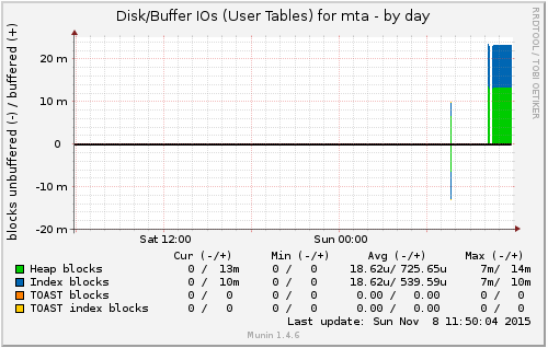
Another way to improve visualisation is using the negative axis. A good example here are locks and disk/buffer I/O. For locks, granted locks can be drawn on the positive axis, while the waiting locks of the same type can be shown on the negative axis. Fo I/O graphs, buffer hits can be shown as positive values, and disk reads of the same time can be drawn as negative values.
Using both positive and negative values cuts down the number of colors used on a graph by a factor of 2. And thus make it easier to read again.
Current State
I am currently writing a minimal viable product to replace the existing plugins. As of today, I have working graphs for:
- Connections (breakdown by user)
- Sizes
- Locks
- QueryAges
- TableDiskIO (former buffer-cache)
- IndexDiskIO (former buffer-cache)
- SequencesDiskIO (former buffer-cache)
The current source can be found on github
